
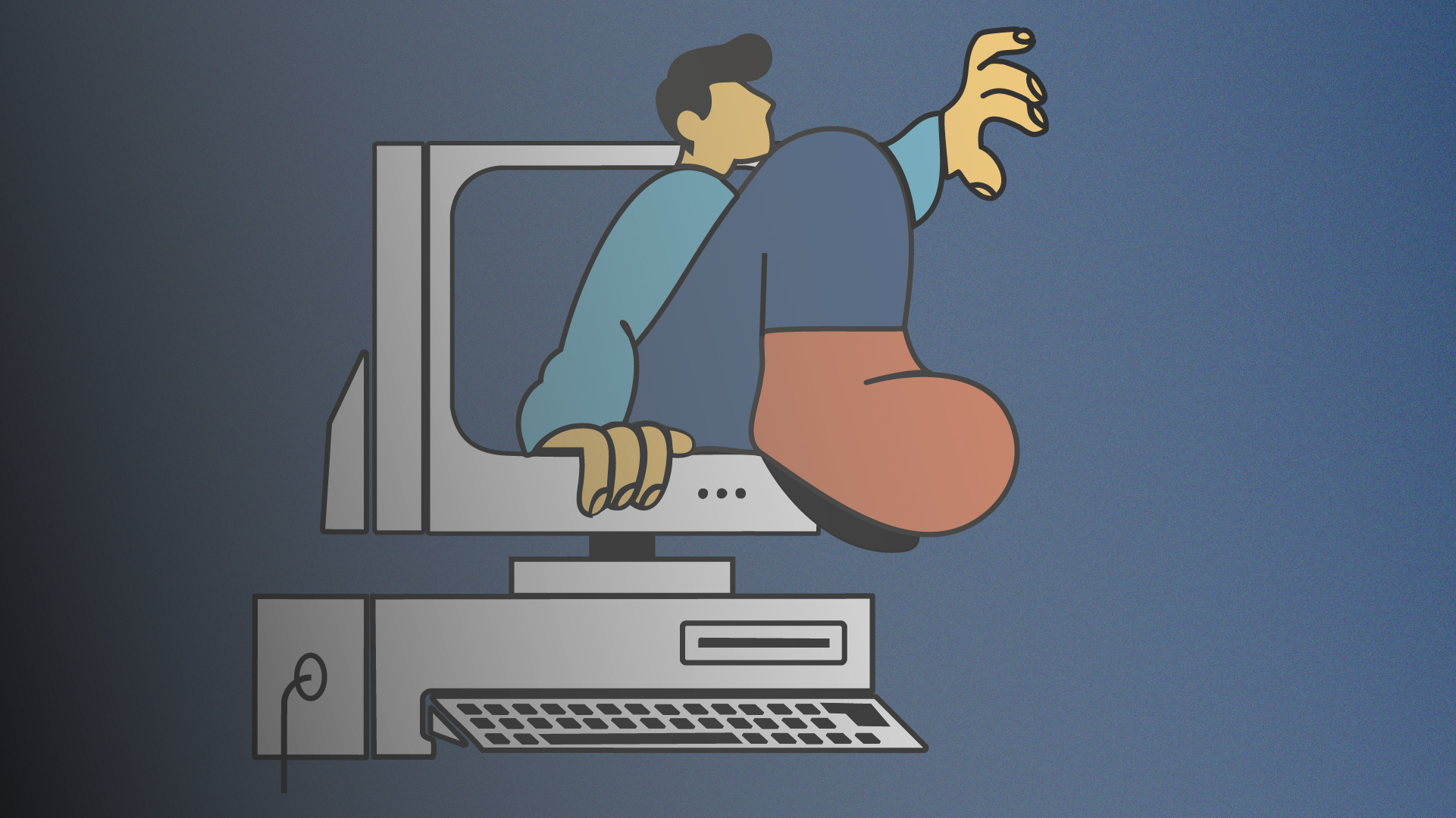
You deserve software that works as beautifully as it looks.
In 2025, the bar for a smooth UI/UX experience sits higher than ever. Users expect the polish of consumer apps – even from internal dashboards – and they’re quick to abandon anything clunky. That abandonment is expensive: 77 % of new apps lose all daily active users within three days, when usability is poor.
We see this every day at Conn3cted: when software is easy and pleasant, teams work faster and feel happier. So why are so many companies still stuck with tools that feel like they’re from another decade?
The hidden costs of bad UI/UX
Let’s break it down:
Together, UI and UX shape how people interact with any digital tool – from internal dashboards to customer-facing apps. And here’s the thing: if the experience is bad, people stop using it. Fast.
Ugly or confusing software has hidden costs:
- People avoid using it: If it’s hard to use, staff find workarounds or skip using it, which wastes money.
- You spend more on training and support: Confusing tools mean more questions and more time showing people how things work.
- Your business looks unprofessional: Old-fashioned or ugly software makes your whole company seem out of date. Nielsen Norman Group explains how first impressions from software UI shape trust and credibility.
Why expectations are higher than ever
People expect work software to be as easy as personal apps.
- Gen Z and younger employees demand better. The gap between the apps we use in daily life and the software we use at work is shrinking fast. Today’s employees – especially Gen Z and Millennials – have grown up with technology that is fast, visually pleasing and intuitive. They now expect those same standards in every tool they use on the job.
- Switching tools is easier than ever. Businesses that ignore this shift risk losing both customers and staff.
- Even internal tools need a glow-up. In the past, only customer-facing apps got the design love. But today, internal dashboards, CRMs, HR tools – everything needs to be easy and pleasant to use. Why? Because happy staff = better output.
”Design isn’t just about beauty. It’s about making work easier.
So what should you look for in well-designed software?
- Clear layout – no guessing where to click
- Fast and responsive – no lag or loading purgatory
- Consistent design – same style across all screens
- Accessible to everyone – easy to read, mobile-friendly
- Looks good – because yes, aesthetics matter
The takeaway
Ugly or frustrating software isn’t a “nice to fix later” problem – it’s a business risk. The cost of poor design shows up in lost time, lost trust and lost people.
We believe your tools should be as enjoyable to use as your favourite app. When software works with your team – not against them – productivity soars.
Let’s stop settling for clunky. It’s 2025. Your tools should look good, feel smooth and help your business thrive.
With Conn3ctedAI, we build custom tools that don’t just function – they feel good to use. Clean interfaces, smart automation and a seamless experience from end to end.
Because the best software? You barely notice it. It just works. Beautifully.
